The challenge
When Microsoft migrated from Workplace Analytics (WPA) to Viva Insights, one of the most important features that customers needed in the new platform was Partitions.
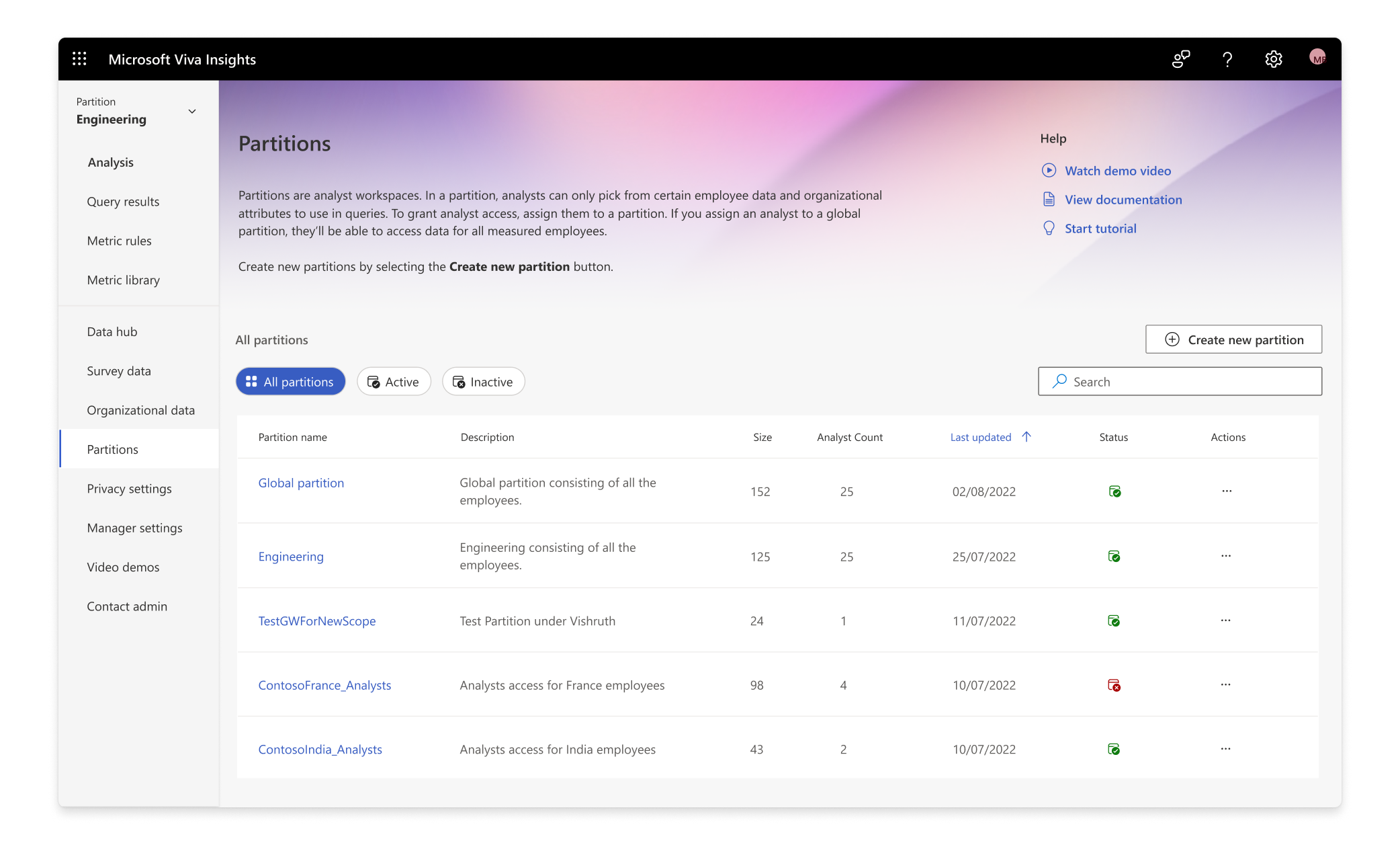
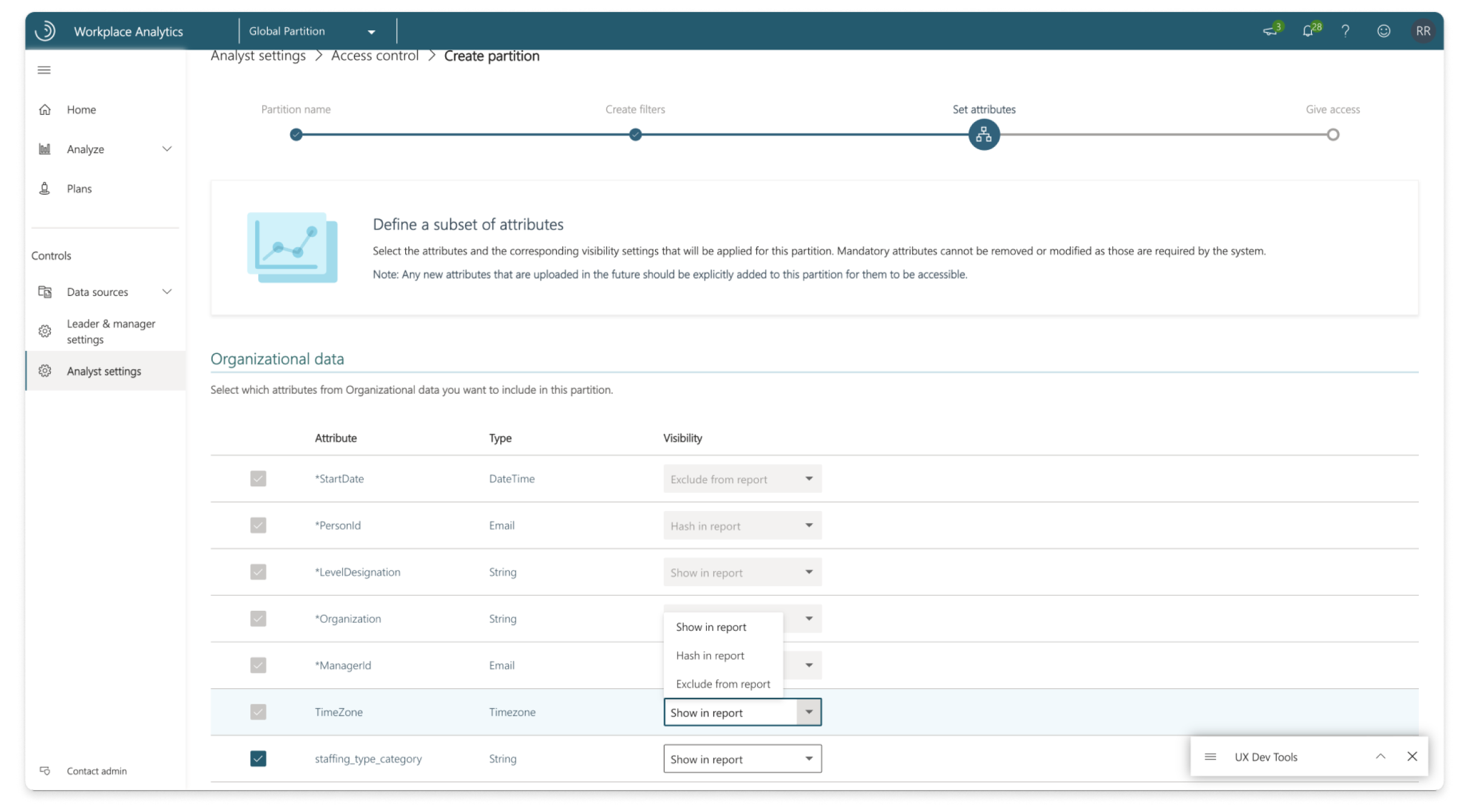
Partitions helps an administrator create a sub-workspace with support for targeted analyses and methods of sectioning off parts of their organisation for analysts to work on. We wanted to enable them to create such partitions in the most easy and effective way possible.
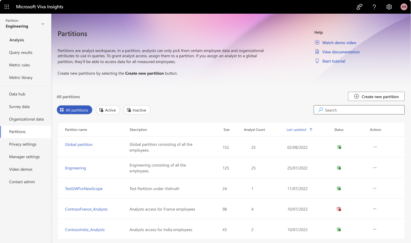
As of Feb 2024, Partitions is now generally available, and it has helped unblock the migration of our strategic and active customers (1.5+ mn licenses) to the updated platform. At the time of writing, 70+ tenants are using Partitions and have created more than 125 partitions.
TLDR, to enable administrators to create partitions in Viva Insights while adhering to privacy standards and platform constraints.
Understanding the existing platform
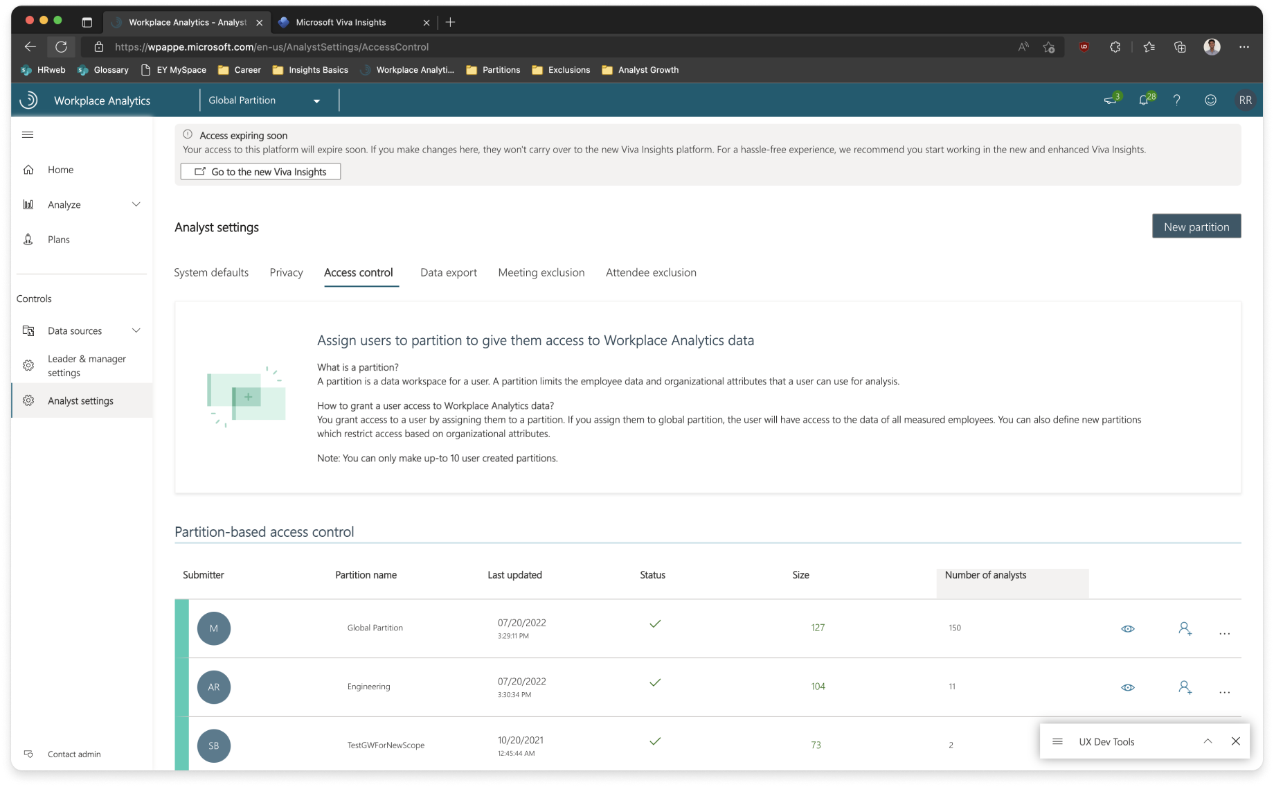
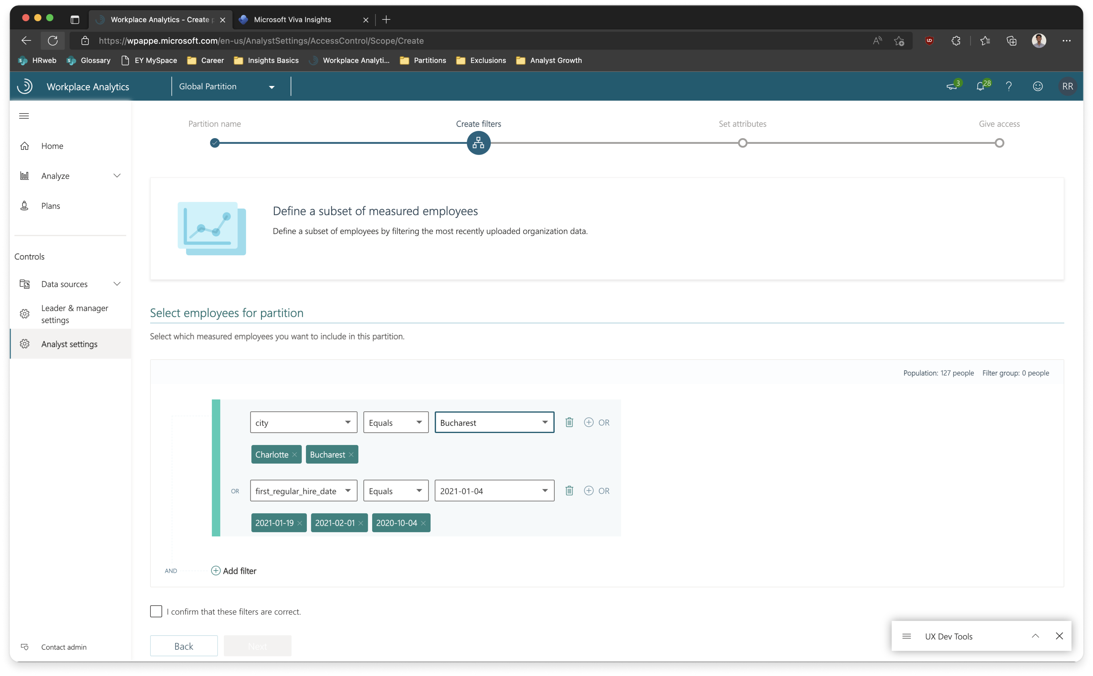
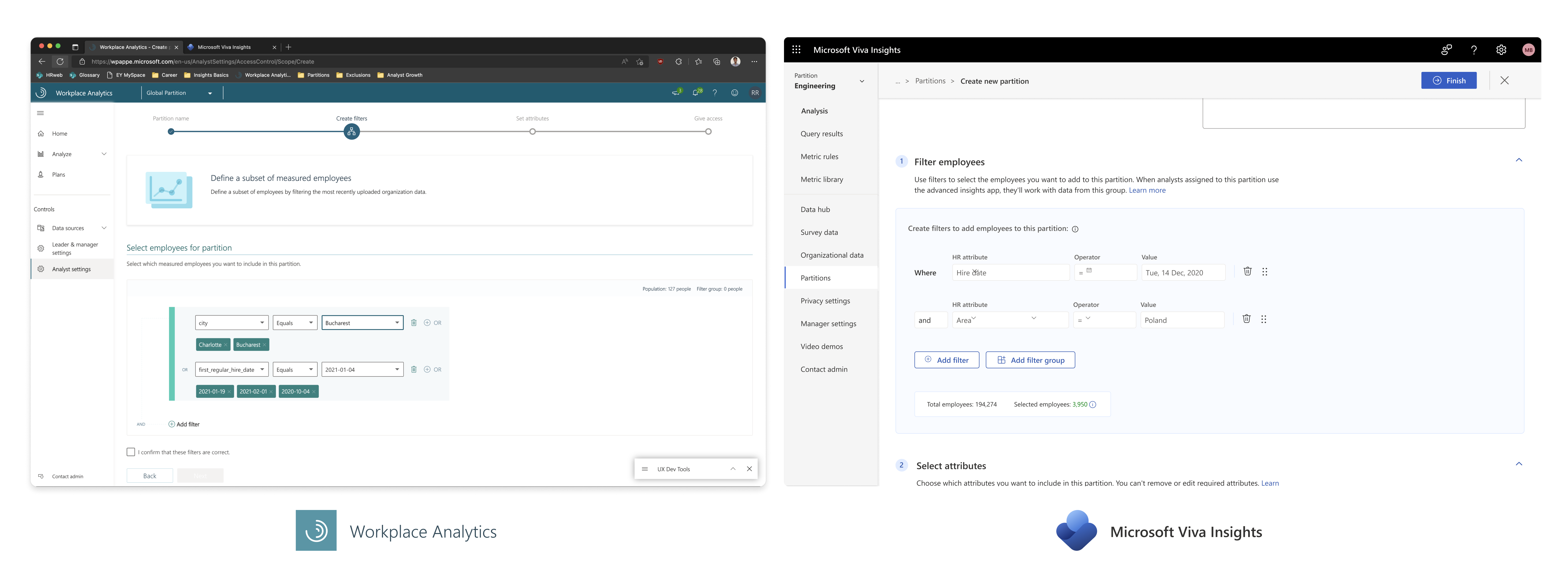
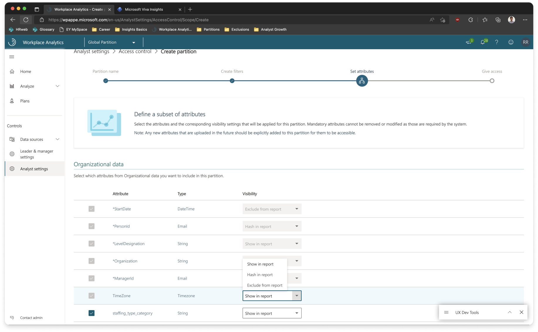
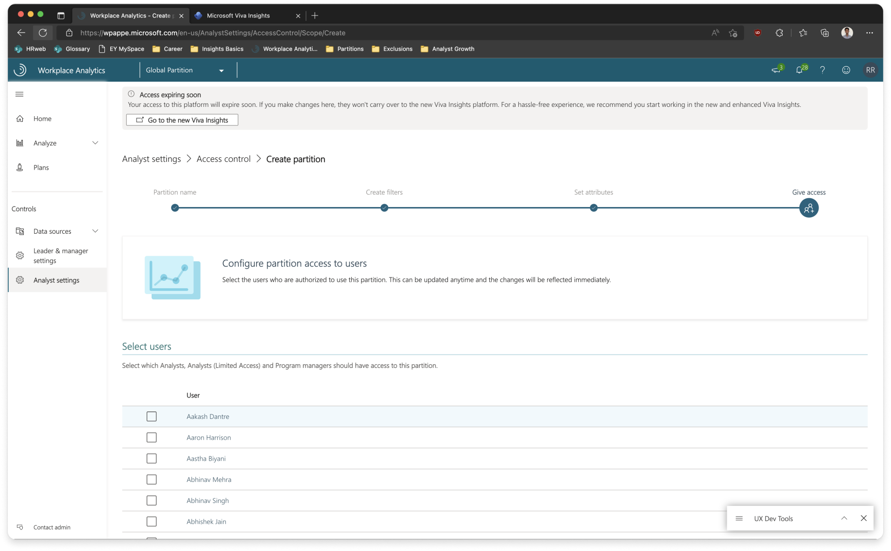
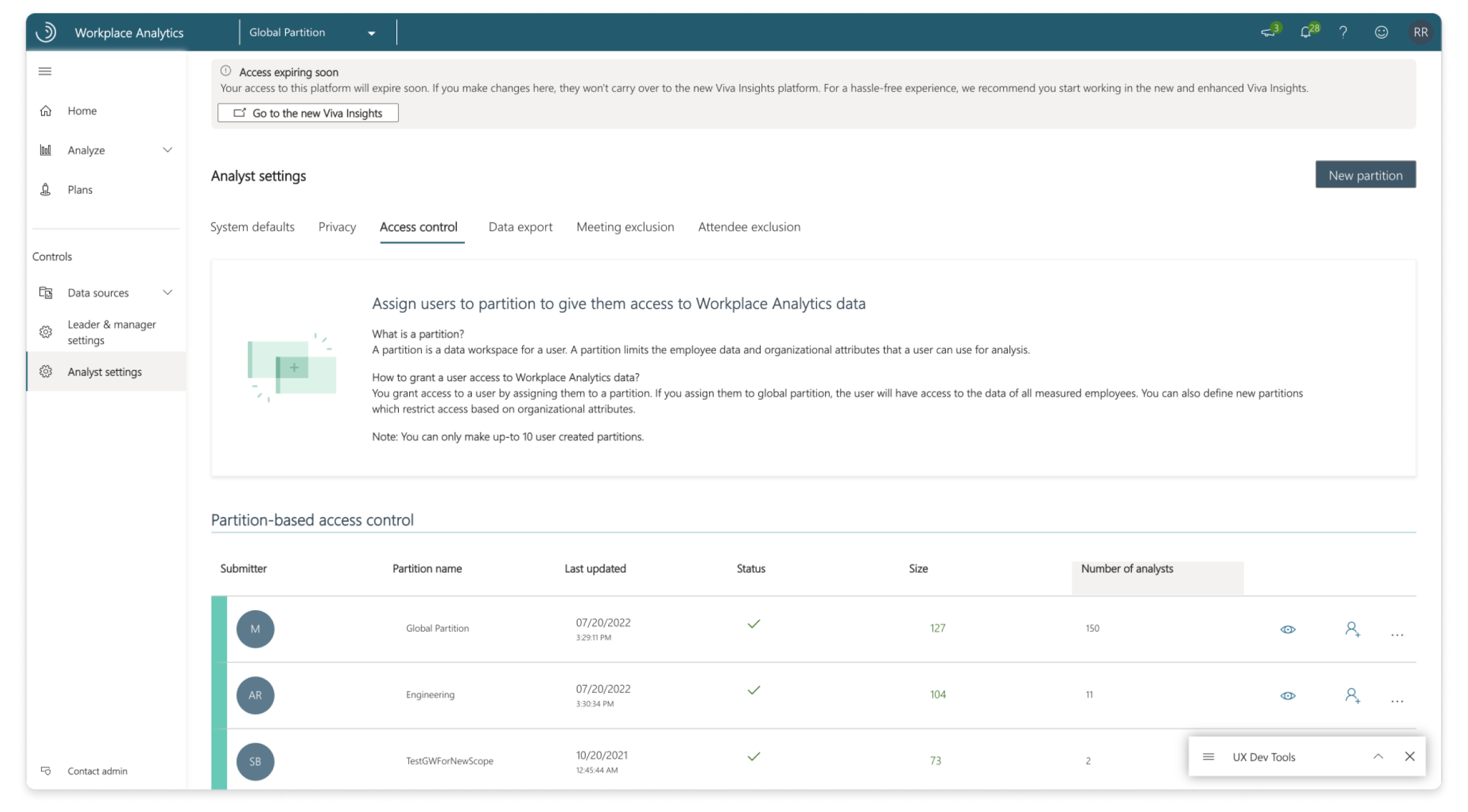
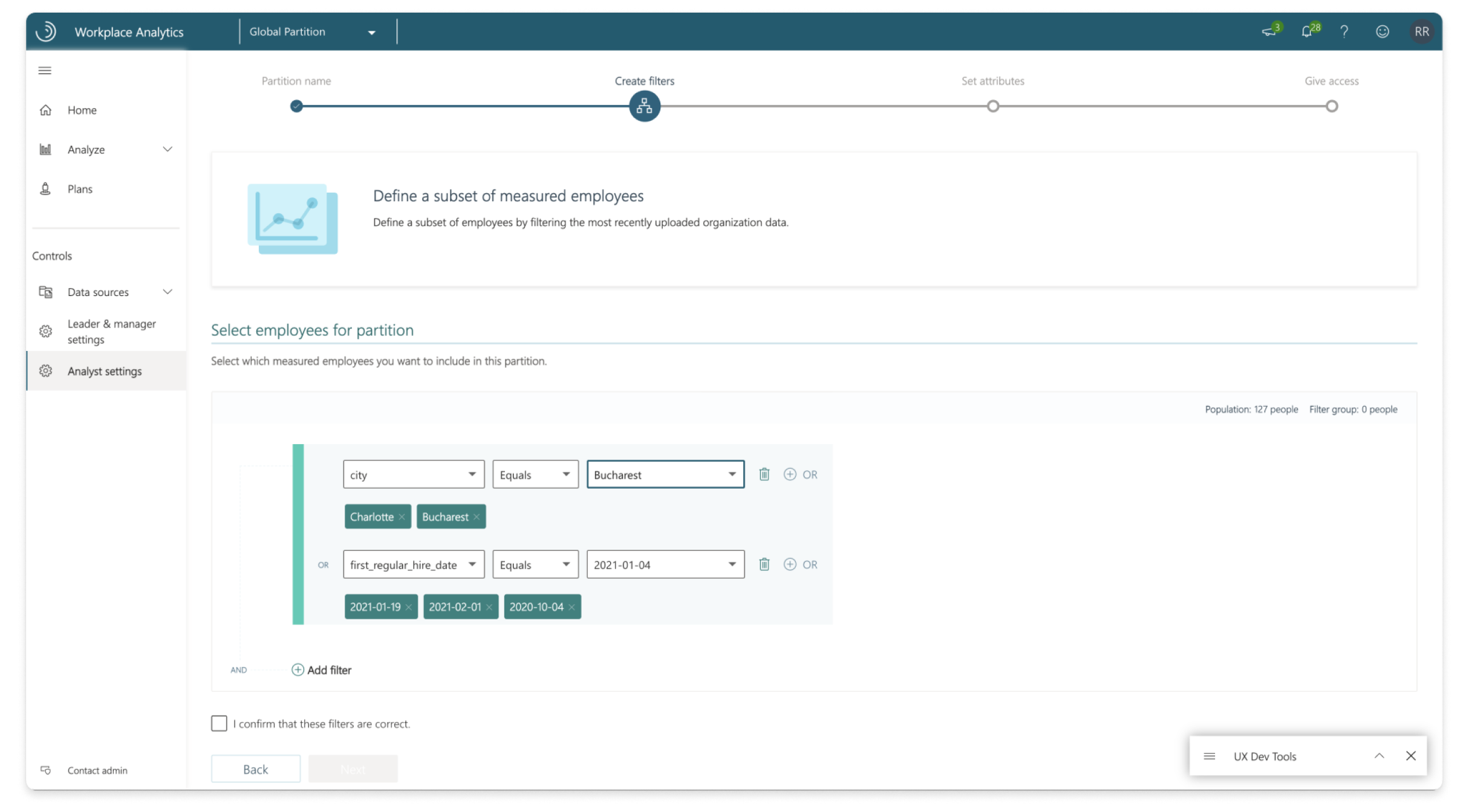
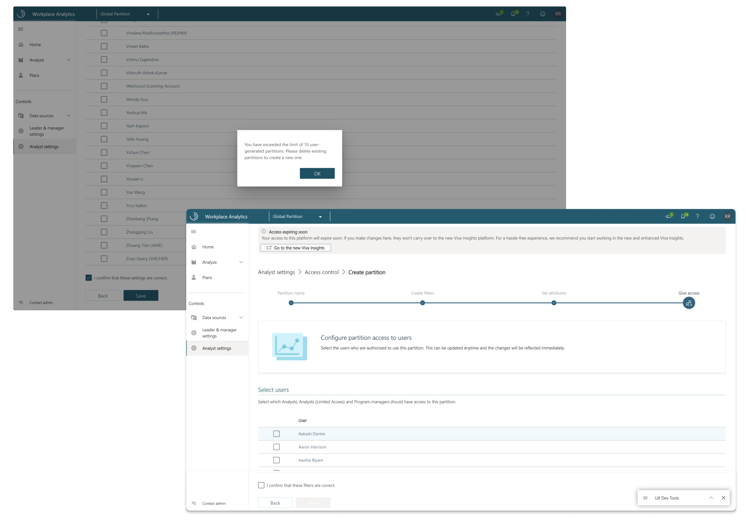
I started off by looking at how Partitions worked in Workplace Analytics (WPA). This gave me a better understanding how an administrator approached this feature and what their painpoints were. A typical partition assignment included 4 major steps. I was to focus on the CRUD experience of the feature, keeping usability and design finesse in mind.
Measuring usability through SUS
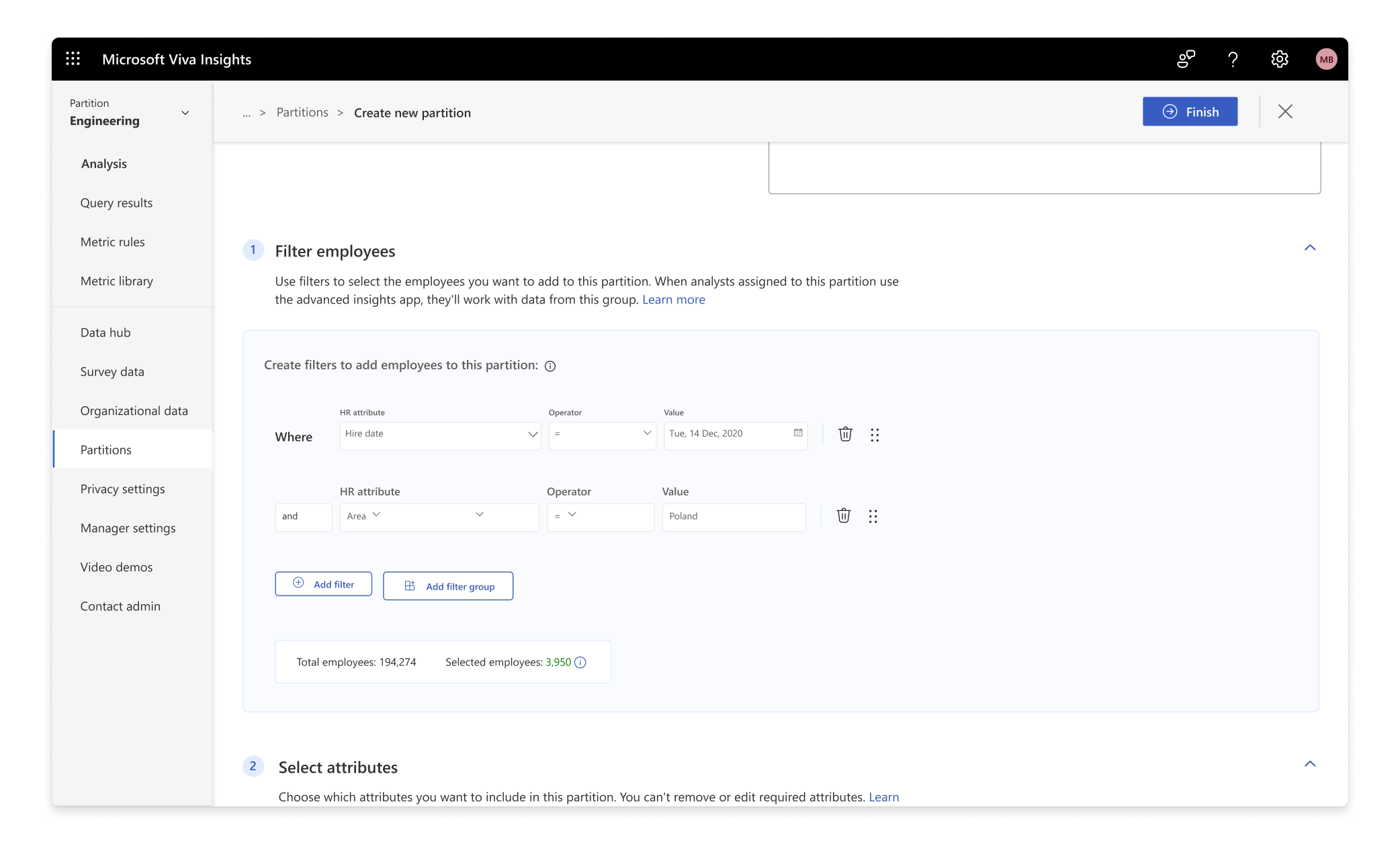
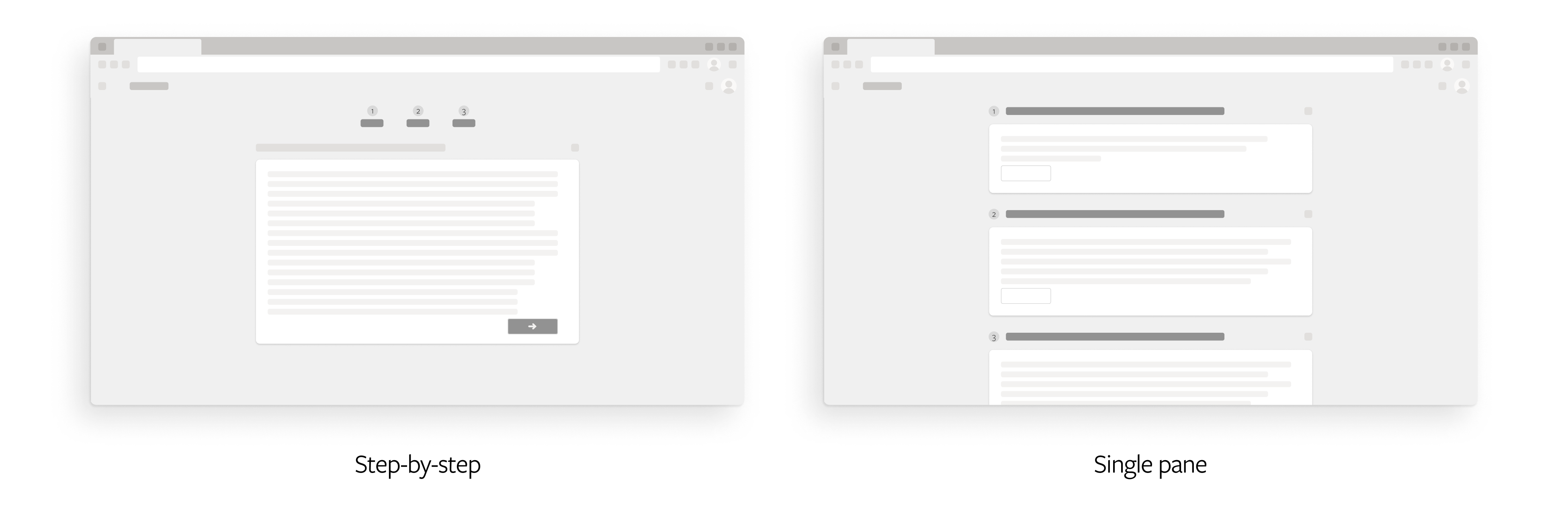
One of the key decisions which we had to make was to go forward with the current step-by-step wizard or design a new single pane wizard.
For evaluating this, we conducted an unmoderated user testing on Usertesting.com and used System Usability Scale testing. For the uninitiated, it’s a widely used method for evaluating the usability and user-friendliness of a system or software application. SUS testing involves surveying users and asking them to rate the system’s usability based on a standardised questionnaire. The results are then analysed to assess the overall user satisfaction and usability of the system.
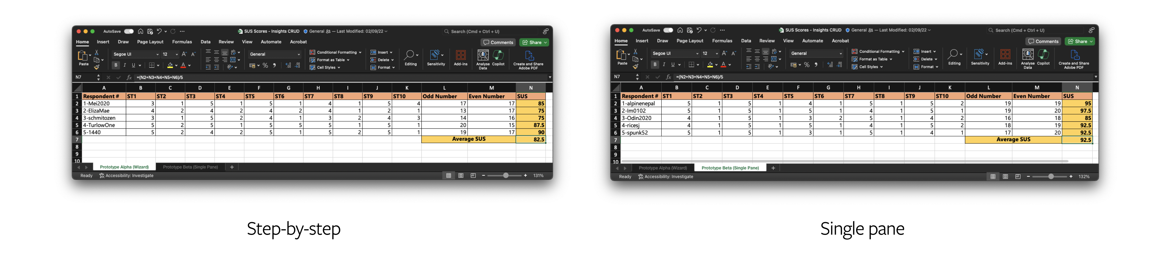
The test had 10 questions laid out, where they had to mark between 5 points from Strongly agree to Strongly disagree.
For odd-numbered, positively worded questions,
1 is subtracted from the respondent’s score.
For even-numbered, negatively worded questions,
the score is equal to 5 minus the score given by the respondent.
Finally, this total is multiplied by 2.5 to obtain an average SUS score between 0 and 100.
From the above sheet, you can see that people preferred single pane wizard over the step-by-step wizard.
Partition switcher
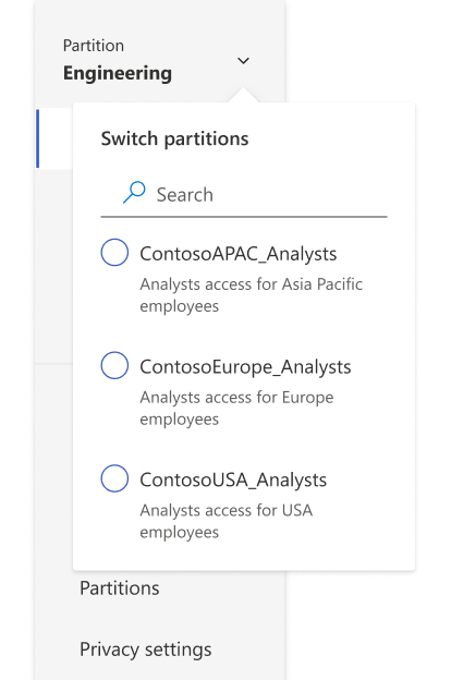
A dropdown was the best option as it easily lays out multiple items in a list. Description was also added with every partition so that it's easier for the user to identify what partition it is.
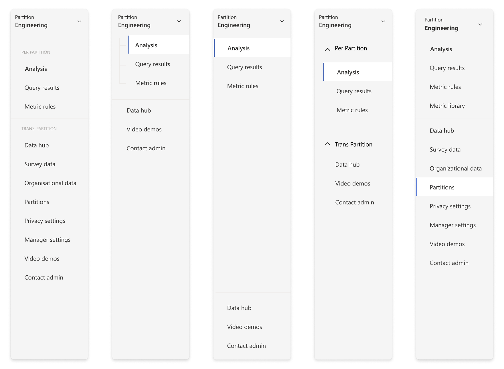
However, the challenge was to differentiate partition-specific pages from global pages to avoid confusion. We had multiple iterations for this. In the end, we decided to go with a simple horizontal line between the pages to make it as easy as possible for the admin to understand without complicating the navigation.
Toggle and onboarding
The final part of our puzzle was figuring out how to let admins enable Partitions for their tenant. The tricky part over here is that, once Partitions is enabled, analysts will have to be manually assigned to at least one partition to work on Viva Insights and conduct analysis. This is a shift in paradigm for the admins as before Partitions, any analyst who was assigned Viva Insights in the Microsoft Admin Center, will automatically get access to all data.
Educating our admins about this change without adding too much friction (so that our admins don’t get scared of the feature and decide not to use it :3 ) was our final hurdle before GA.
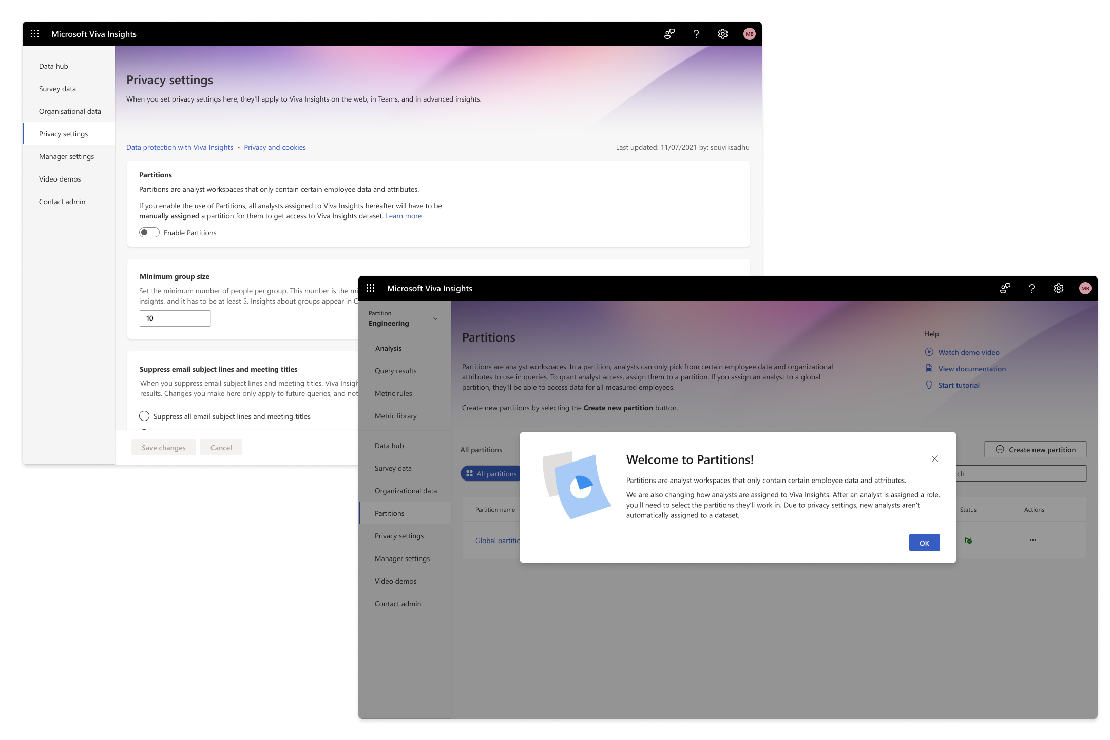
We first tried out a modal experience when the user first landed in the page. This explains what partitions is and how the analyst onboarding experience has been changed. We realised from our user testing that they rarely read the body text, especially when its this long.
Moreover, the info is only conveyed to the admin if he enters the ‘Partitions’ homepage. This would lead to confusion to admins who may have not visited the page.
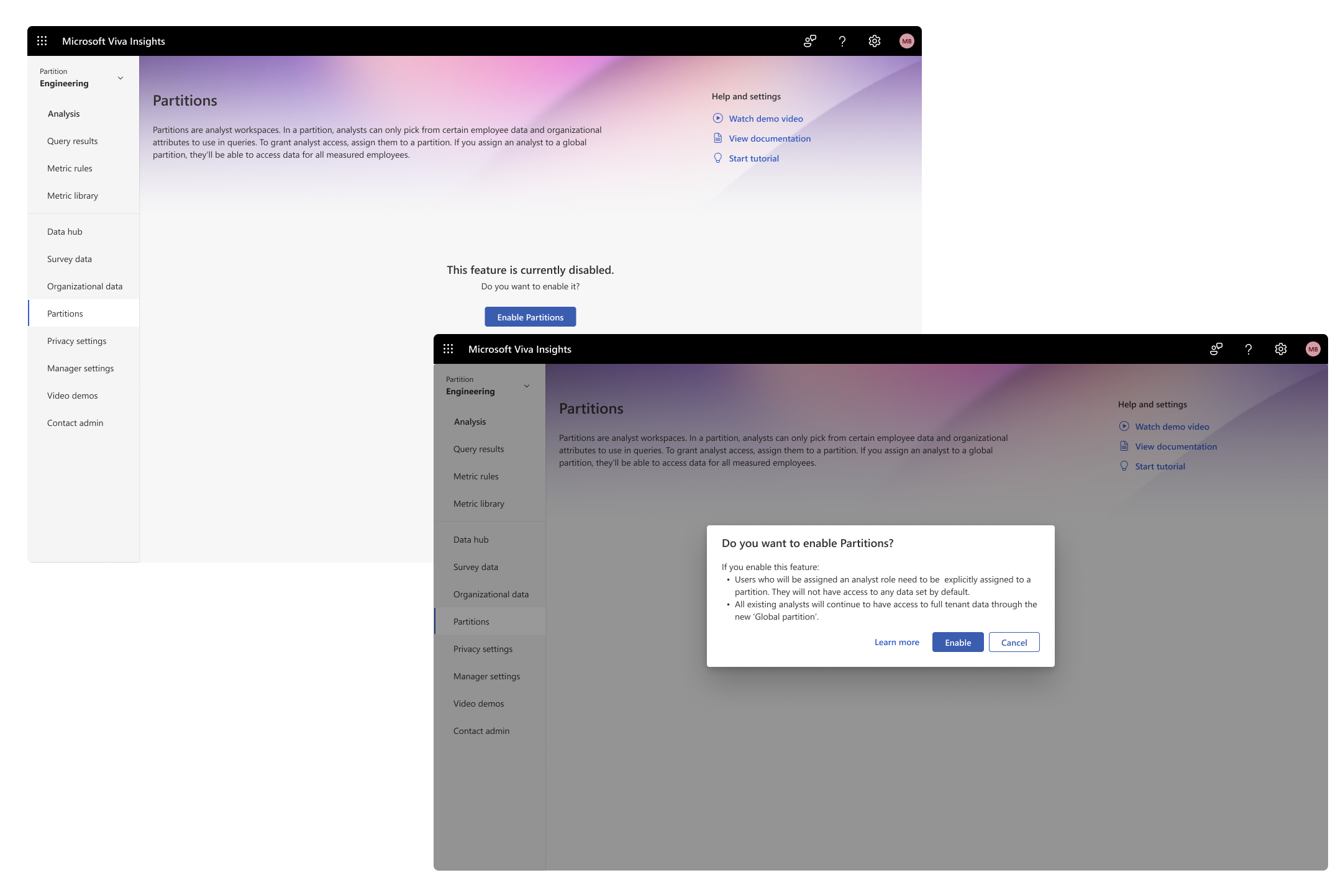
We then explored an experience where the admin can enable the setting through the Partitions homepage. This gives the admin an explicit message on what will happen when Partitions is enabled for their tenant.
The problem with this approach was since Partitions is an opt-in feature and is a highly data-sensitive one at it, the team did not prefer the idea of keeping the Partitions tab easily accessible.
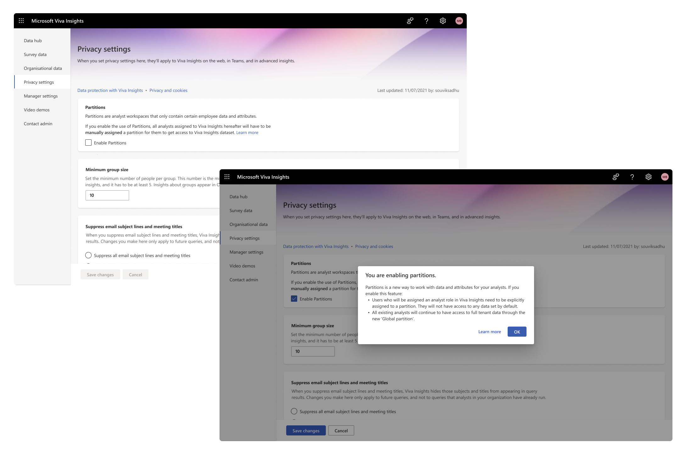
This brought us to the final experience which got shipped. Over here, the user has to navigate to Privacy settings and toggle on Partitions to enable it for their tenant. Once toggled, the user will be presented with a info modal, which explains how it will affect the tenant.
Finally, as an additional measure, the user has to click on ‘Save changes’ to confirm the enablement of the feature.